GroveHR
Putting desktop HR platform in people's pockets
HR
[Design Only]
Product Design, Design System
1+ year, Full-time
KMS Technology
UI/UX Designer to Senior UI/UX Designer, two promotions in twelve months
Two designers, three developers, one QA
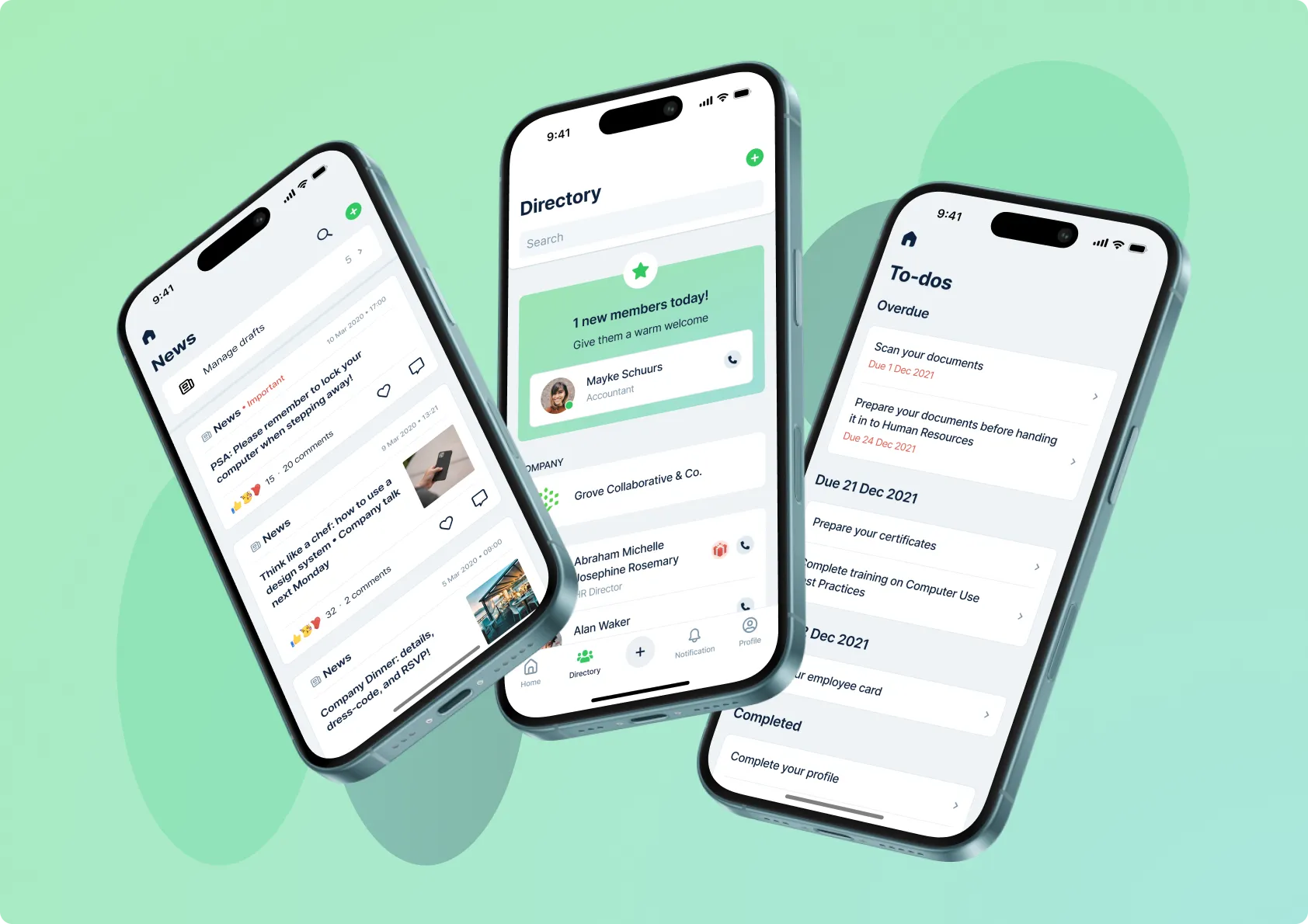
Grove HR is an HR platform: request leave, clock in, look up a colleague, approve a team’s day. By the time I joined, the web product carried thirteen modules and the business rules that had accumulated behind them, while the mobile app had inherited only a fraction of those rules and had been built module by module with nothing underneath holding it together, so each one had arrived at its own way of doing the same few things.
Over twelve months I came to own all of the mobile design, and the design system with it, redesigning every screen in the app and rebuilding the system beneath them. The two grew together: I moved old screens onto the new system, then extended the system wherever a screen needed something it didn’t yet have.
[image:overview]
Request time off in just a few taps
Requesting time off is one of the most commonly taken actions in the app. A request needs three things before it can go anywhere:
- A leave type
- A date, or a range of dates
- A duration, which might be hourly, half a day or a full day depending on the policy
Customers configure their own leave types and policies, so the design had to hold all of them without branching. On desktop that sits on one page as a form, which a phone has nowhere near the room for.
My first thought was a step-by-step flow, the way a hotel booking asks for dates, then rooms, then guests, putting one question on screen at a time.
Bringing it to my design lead, who owned desktop and carried the product’s history with her, turned up the case it didn’t serve. It worked for someone requesting leave for the first time, but people request leave several times a year, and they open the app with the answer already formed: three days of annual leave, next Monday to Wednesday. Walking that person through three screens to collect something they decided before unlocking their phone is tedious the second time and worse the fifth, and changing one of the three meant travelling back through the flow and forward again.
So the next version took the three required fields out of the flow and onto the module’s overview screen, ready the moment it opens, where someone who already knows what they want fills all three in one pass. That trades one problem for another, since the screen now opens with three decisions rather than one. What made it work was giving people less to decide rather than less to look at, so it reads as a request already half written for them:
- The default leave type is already selected
- The calendar is open rather than waiting behind a tap
- The duration is inferred from the leave type and the number of days chosen
- Any day the customer’s policy rules out is disabled, so an invalid request can’t be built and then refused
[image:time-off-overview]
The optional information sits behind that: pressing Next opens a sheet carrying the three choices over, collecting the note, the attachment and the people to notify, and laying the finished request out in one place where any part can be changed before submitting. That keeps the overview screen down to what everybody needs and the extras one tap away.
[image:time-off-sheet]
In a working session, the developers raised the thing that would make this expensive to build. Leave type multiplied by duration multiplied by which role is looking gives a lot of possible versions of a single screen, many of which only some companies would ever see. Each still had to look like something. We agreed the safest answer was to leave none of it open, so I designed all of them, the impossible combinations included, along with the manager’s view of each. The flow came to thirty-six screens, and nothing was left for anyone to work out during the build.
An app this size has its modules leaning on each other constantly, and the last of those optional fields is a good example. Choosing who to notify is the same task as choosing who can see a news post or who a policy applies to, and it comes up in many of the modules, so it was worth solving once rather than every time it appeared.
Easily find the right person, in a team of 5 or 500
What the app had was a search field over employee names with everyone in the company selected by default, so anyone wanting something narrower had to find and deselect their way down to it. That holds up in a company of five, where the list is short and you know every name on it, and falls apart long before you reach five hundred.
Rather than build one screen decent enough for both, I made the first thing you meet a set of ways to describe a group rather than a list of people: everyone, an office, a department, only specific people, everyone except. For most customers, who are small and mid-size businesses, the answer is everyone or one department, which they can give without opening a list of names at all. The most complex step is reserved for the most complex needs, and because it sits at the end of that path, it can be as heavy as the hardest case requires.
[image:people-select-scopes]
Inside the picker, my first version searched names and email addresses. A round of internal review surfaced the case that breaks it: people often know neither, and know who they want as the most senior person in that department, or whoever runs the Hanoi office. So the next version put filters beside search, by location, department and job title. Narrowing the list is the obvious job; the more useful one is that a filter shows what exists, so opening the department filter tells you what the departments are called, which is frequently the actual gap between knowing who you want and being able to select them.
[image:people-select-filters]
Selection had a smaller problem of its own, since the list is always taller than the screen and you lose sight of what you have chosen. I pinned a row of avatars above it showing who is selected and how many. The two more common solutions each cost something:
- A check mark beside every name means scrolling back through the list to remember your own choices
- Lifting selected people to the top reorders the list under the thumb, so every tap is followed by either a wait or the wrong name
[image:people-select-selected]
Approve a whole team’s day in one go
Another of the app’s most common actions is clocking in and out, and it has a different shape to it. Where a time-off request is something one person files occasionally, attendance is something a manager handles every working day for everyone reporting to them, on a screen that also has to cover office work, part-time shifts and several check-ins in a day.
For the manager I started from what already worked in time off and put Approve and Reject on each attendance card, which is a reasonable place to begin, because it is how a request behaves: one arrives, you read it, you decide on it. Validating it with the team made clear that attendance doesn’t behave that way. It comes in as an entire team, every day, and the common case is that everything is fine, so approving card by card means tapping down a list to confirm what you already expected and doing it again tomorrow.
The second version moves Approve and Reject to the top, where they act on the team rather than a row, opening a sheet with every team member’s attendance already checked so the manager confirms the lot or unchecks the few that look wrong first. That makes rejecting one person more expensive, since it now means opening their record and rejecting from there, and I took the trade deliberately: rejection is the rarer action, and it is also the one that needs the detail, because a manager rejecting someone’s hours has to be able to say why.
[image:attendance-approval]
Consistency and familiarity across modules
By the end, the handful of tasks every module had been solving on its own terms were solved once: switching between acting as yourself and acting as a manager, getting back to the homescreen, naming a group of people, creating a new thing. People Select is the clearest of them, designed once and then used as it was wherever the question came up, so a module needing to name people spent no time designing or building one. None of this was assigned; it ran alongside sprint work rather than in place of it.
The gain shows up in consistency as much as in speed. Someone who had learned to pick people in one module already knew how to do it in the next, and a developer implementing it had a component to reach for instead of a decision to make.
By the time I left, every screen across all thirteen modules ran on that system, and the Android app had passed ten thousand installs, all of them on screens my team and I had rebuilt.